hey yall its me the Art Mom™ to help you shade pretty
rule 1: DO NOT SHADE WITH BLACK. EVER. IT NEVER LOOKS GOOD.
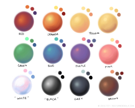
red– shade with a slightly darker shade of purple
orange– slightly darker and more saturated shade of red
yellow– i think like..a peach could work but make it a really light peach
green– shade with darker and less saturated shade of blue or teal
blue– shade with purple
purple– a shade thats darker than the purple you’re using and maybe a little pink (MAYBE blue)
pink– darker shade of red
white– a really light lavender or blue..or i guess any really light colour??
black– okay listen dont use pure black to colour anything unless you want to leave it with flat colours because you cant really shade black lol
grey– a slightly darker shade of purple or blue (less saturated)
brown– slightly darker and less saturated shade of purple or red
aaaaand thats all i got lol. let me know if there is anything i should add to this list!!
If you’re a visual learner…
I made some Balls of Colour to go with Art Mom™’s post:
I know that this post is for drawing, but this can also be used for weathering your props and armor. You can still use some black, but it’ll look much more realistic and have much more depth if you use multiple colors and mix colors, especially if you are using colors that aren’t straight silver or gold. Weathering isn’t just about adding dirt and scratches, it also adds depth to the color and the shadows, so if you use colors other than black before doing your darker ‘dirt’ colors, you’ll get a more satisfying result.